Exploring the Data: Learn from the Food Nutrition
What we could try to explore from the data without any clear aim
What we could try to explore from the data without any clear aim

I love to explore my data and finding unexpected patterns from it. As a data scientist, in my personal opinion, we need to have this curiosity trait to succeed in this field. The way to explore data thou is not limited only to basic techniques such as visualizing the data and getting the statistic number, one way is to implement machine learning.
Machine learning is a technique for exploring data as well, not only for prediction purposes as people often like to promote. This is why I often focus on understanding the concept of the model to know how my data is processed; to know better what happens to our data.
In this article, I want to introduce what information we could get from the statistical number and a data mining technique via unsupervised learning to exploring data. Here, because one of my hobbies is to cook, I would use a dataset from Kaggle regarding the food nutrition value from common food and products. I want to explore this data for both learning and satisfy my own curiosity. It means, my target here is just to know what happens in my data and what kind of information I could get without any specific aim. Let’s get started.
Explore the Data
Data Cleaning
First, we need to read our data and understand how our data is. This is an important first step.
import pandas as pdimport matplotlib.pyplot as pltimport seaborn as snsdata = pd.read_csv('nutrition.csv')data.head()data.info()We actually have 76 columns which I did not show all in here (it would be a really long list) with the data example is shown in the table above.
Most of our data is consists of the nutrition value (calories, fat, sugar, carbohydrate, etc.) with the food name. The nutrition value columns have a different measurement such as g (gram), mg (milligram) and mcg (microgram). In this case, we could also ignore feature serving_size as it does not present any additional information other than all the data is based on the 100 grams of the food. Some of the columns also contain NaN value, which I believe this Null value means there are equal to 0. Now, let us do some data cleaning.
#Drop the serving_size columndata.drop('serving_size', axis = 1, inplace = True)#Fill the NaN value with 0data.fillna(0, inplace = True)In this case, I would want all my features except the name feature to become a numerical column. It means, we need to remove all the non-numerical text in the data. I would also want to transform all the numerical data except calories to have the same measurement (gram). Let’s get into it.
#I would use Regular Expression Module to help me clean the dataimport re#Looping in each non-numerical features except the name feature for col in data.drop('name',axis = 1).select_dtypes(exclude = 'number').columns: for i in data[col]: if i == '0' or i == 0: pass else: point = re.findall('[a-zA-Z]+',i)[0] replace = [] if point == 'mg': for j in data[col]: if j == '0' or j == 0: replace.append(float(j)) else: replace.append(float(re.sub('[a-zA-Z]','',j))/1000) elif point == 'mcg': for j in data[col]: if j == '0' or j == 0: replace.append(float(j)) else: replace.append(float(re.sub('[a-zA-Z]','',j))/1000000) else: for j in data[col]: if j == '0' or j == 0: replace.append(float(j)) else: replace.append(float(re.sub('[a-zA-Z]','',j))) data[col] = replace data.rename({col:col+'(g)'}, axis =1, inplace = True) breakHere is the end result of my data that I would explore even further. Note that I know that all the data is now in the gram measurement except the calories but just for the purpose of learning, I add it in my column name so we did not forget about it.
I also create one more feature called food_categories because when examining carefully that name feature, the first word before the comma would be the food.
data['food_categories'] = data['name'].apply(lambda x: x.split(',')[0])Numerical Statistic
If we try to visualize the columns one by one, it would be massive and kinda repetitive as it would not give us much information. You could try it thou if you want. I could give you the code below.
for i in data.select_dtypes('number').columns: sns.distplot(data[i]) plt.title(i) plt.show()Sometimes in a case like this, if we really just want to explore the data it would be more intuitive to look by the number rather than visualize it (I am a more numerical person after all as I believe sometimes visualization is biased).
pd.set_option('display.max_columns', None)data.agg(['mean', 'median', 'std', 'skew', 'kurtosis'])Here, for example, I use the .agg method of the DataFrame to gain information about the mean, median, std, skewness and kurtosis of each column. This is where the number speak more than visualization.
As we know mean is the average of the data. Multiple features could have the same mean, but different in how they are spread around the mean and it signifies by the standard deviation (std). There is a rule called an empirical rule where we could get the probability of the data spreads via standard deviation. The empirical rule stated that:
68% of our data falls under mean±1*std
95% of our data falls under mean±2*std
99.7% of our data falls under mean±3*std
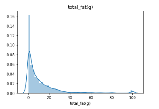
Empirical rule or some also say 68–95–99.7 rule are often used to analyzing the data outlier. The main problem with this statistic is that they are affected by outlier or extreme value(s) and often causing the data to be skewed. I show you with an image what is skewed data.
Above is the plot of the total_fat(g) feature. It is skewed right as the tail is on the right. But, how skewed is the skewness? It is the purpose of the skew statistic. Some rule we could remember about skewness are:
If the skewness is between -0.5 and 0.5, the data are fairly symmetrical
If the skewness is between -1 and — 0.5 or between 0.5 and 1, the data are moderately skewed
If the skewness is less than -1 or greater than 1, the data are highly skewed
So we could see that if our data above is highly skewed, which actually most of the data that you would encounter is like that. Now, what about kurtosis? What is this statistic tell us? Kurtosis is a measure of whether the data are heavy-tailed or light-tailed relative to a normal distribution. The analysis could be summarized below:
If the kurtosis is close to 0, then a normal distribution is often assumed. These are called mesokurtic distributions.
If the kurtosis is less than 0, then the distribution is light tails and is called a platykurtic distribution.
If the kurtosis is greater than 0, then the distribution has heavier tails and is called a leptokurtic distribution.
If we visualize it, it would look like the picture below.

To be precise what we have before is called Excess Kurtosis, where normal distribution is measured in kurtosis as 0. If we only talk about Kurtosis, the normal distribution would be equal to 3 so that is why in Excess Kurtosis we subtract the kurtosis by 3.
Turn out most of our data are skewed. Skewed data are actually really interesting as you could try to explore with it. For example, what food is considered to be an outlier based on the Calories.
As our data is skewed enough, I would not rely on the mean to find the outlier; instead, I would apply the IQR method which is based on the median.
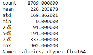
IQR or Interquartile Range is based on the data position. For example, if we describe the ‘calories’ feature we would get the description below.
data['calories'].describe()IQR would be based on the 25% position or Q1 and 75% position or Q3. We also get an IQR value by subtracting Q3 with Q1 (Q3-Q1). With the IQR method, we could decide which data are considered an outlier based on the upper or lower limit which is:
Lower Limit= Q1–1.5 * IQR
Upper Limit= Q3 + 1.5 * IQR
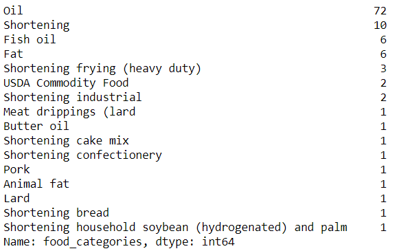
Any data above or below this limit would be considered as an outlier. Let’s try to implement this method and let’s see what kind of food is considered to be an outlier based on calories.
#Specifying the limitcal_Q1 = data.describe()['calories']['25%']cal_Q3 = data.describe()['calories']['75%']cal_IQR = cal_Q3 - cal_Q1data[(data['calories'] < 1.5 * (cal_Q1 - cal_IQR)) | (data['calories'] > 1.5 * (cal_Q3 + cal_IQR)) ]['food_categories'].value_counts()Turn out, most of the high calories food category is oil, which is not surprising.
Unsupervised Learning
Above I show you a way to explore the data numerically, now I want to show you an example of how machine learning could help us explore the data.
Unsupervised learning is a machine learning case where we did not have any specific target to learn. One example is Clustering Analysis, where we feed the model with data and the output is a cluster of data where closest data is treated as one cluster.
What I like to do if we did not have any specific target for exploring data, we could leave it up to the machine learning to learn it for us. Using unsupervised learning, we could gain a new perspective that we did not realize before. Let’s do it by example with my favorite clustering analysis algorithm.
My favorite clustering algorithm is Agglomerative Clustering Analysis which you could read about it in detail here. Basically, this analysis assigns every single data point as a single cluster and proceed by merging every cluster so we left with a single cluster.
Now, before we proceed with the analysis, we need to prepare the data. Clustering analysis depends on the distance between the data. The distance of the data would be affected by their scale, that is why we also need to transform all of the features to have the same scale. If you remember, we already have every single column in our features to be in the gram measurement, but there is a ‘Calories’ column that is not on the same scale. This is why we still need to transform the data. Often we transform the data to following the standard distribution and that is what we would do.
#Importing the transformerfrom sklearn.preprocessing import StandardScaler#Transforming the data, I drop the name feature as we only need the numerical columnscaler = StandardScaler()training = pd.DataFrame(scaler.fit_transform(data.drop('name', axis =1)), columns = data.drop('name', axis =1).columns)This is what we end up with, a dataset with the same scale for every feature. Now, let’s try to cluster the data via Agglomerative Clustering. First, we visualize how the cluster would end up with.
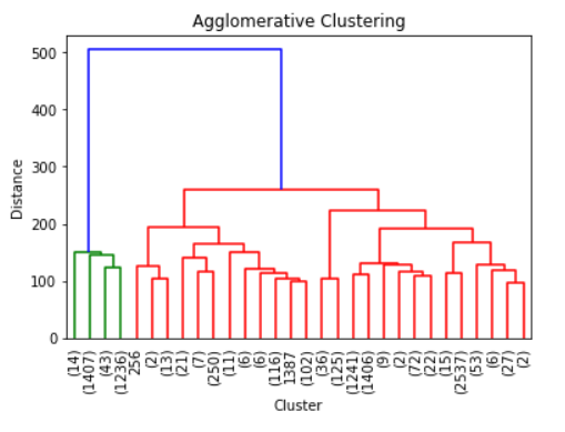
from scipy.cluster.hierarchy import linkage, dendrogram#Ward is the most common linkage methodZ = linkage(training,method = 'ward')dendrogram(Z, truncate_mode = 'lastp')plt.xticks(rotation = 90, fontsize = 10)plt.ylabel('Distance')plt.xlabel('Cluster')plt.title('Agglomerative Clustering')Above is the tree produced by the Agglomerative Clustering. It only shows the last 30 merging events because it would be packed if we showed it all here. As we can see, it seems that the data could be divided into 2 clusters; of course, if you want to be more conservative it could be divided into 3 clusters as there is evidence in the visualization above that it could be the case. Although, I would keep it as 2 clusters for now.
Let’s get back to our previous data and input the Agglomerative Clustering result in our data.
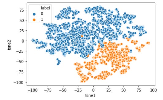
from sklearn.cluster import AgglomerativeClustering#I specify n_clusters to be 2 based on our previous analysisach = AgglomerativeClustering(n_clusters = 2)ach.fit(training)#Input the label result to the datadata['label'] = ach.labels_Now, via unsupervised learning, we could actually try to visualize the multidimensional data into two axes. There are several ways to do that, but I would show you a technique called t-SNE.
from sklearn.manifold import TSNE#t-SNE is based on a stochastic (random) process, that is why I set the random_state so we could repeat the resulttsne = TSNE(random_state=0)tsne_results = tsne.fit_transform(training) tsne_results=pd.DataFrame(tsne_results, columns=['tsne1', 'tsne2'])#Visualize the datatsne_results['label'] = data['label']sns.scatterplot(data = tsne_results, x = 'tsne1', y = 'tsne2', hue='label')plt.show()Now our multidimensional data have been visualized and clearly the agglomerative clustering method separates our data in a clear line. Well, what exactly makes them separated? it is what we need to analyze. No easy way except getting dirty with the number again. Of course, visualization would help here. I would give the code for the distribution of each column below.
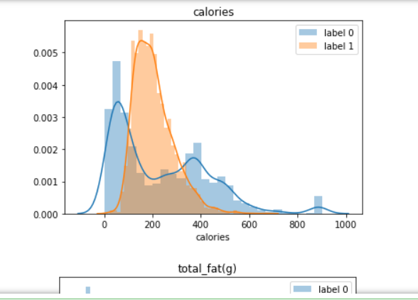
for i in data.select_dtypes('number').columns: sns.distplot(data[data['label'] == 0][i], label = 'label 0') sns.distplot(data[data['label'] == 1][i], label = 'label 1') plt.title(i) plt.legend() plt.show()Above is a looping distribution plot for each column, but if you prefer using a number like me; we could use the groupby method from the DataFrame object.
data.groupby('label').agg(['mean', 'median', 'std'])The result would be looks like above. I have done some analysis that makes them separated. Here is my summary:
Label 0 indicates food with less protein, more sugar and carbohydrates, more fiber, less fat and cholesterol, and the calories are spread except around 200 calories.
Label 1 indicates food with more protein, less sugar and carbohydrates, less fiber, more fat and cholesterol, and calories is only spread around 200 calories.
We could also see what kind of food we have from the label above.
#Food label 0data[data['label'] == 0]['food_categories'].value_counts()Top 5 of the food with label 0 are beverages, cereals, baby food, soup, and snacks which is expected for a food that did not contain much protein and fat.
#Food label 1data[data['label'] == 1]['food_categories'].value_counts()Here in the label 1, the top 5 food is all meat. This is not surprising, considering this label is for food that contains higher fat and protein compared to label 1.
Conclusion
Here I just try to playing around with the data and try to get what pattern I could get from the data. I did not have any specific aim except to get an insight into what my data would provide me.
We could see that sometimes number could tell more information compared to the visualization and machine learning is not always use for prediction but could be used as well for analysis.


