How to Visualize Missing Data Patterns with missingno in Python - NBD Lite #26
Gain insight from your Missing Data
Missing Data is a data point.
If you drop them as it is, you might miss so much information from the missing data.
Sometimes, missing data happens because of an accident or pure chance, but this is often untrue.
Missing data might uncover insight that we never knew previously.
In this case, we can use the missingno, a package specifically developed to visualize your missing data.
How to use them? And what insight you could get. That’s what we would explore together!
Missingno Python Package
Let’s start by installing the missingno package.
pip install missingnoFor this example, I would use the Missing Migrants project dataset from Kaggle.
df = pd.read_csv('MissingMigrants-Global-2019-12-31_correct.csv')
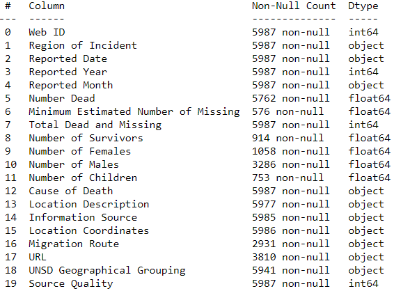
df.info()
The dataset contains many missing data with different amounts in each column.
Why does this is happening? Are there missing data patterns here? Let’s find it out using missingno.
To begin, let’s visualize the missing data numbers.
import missingno

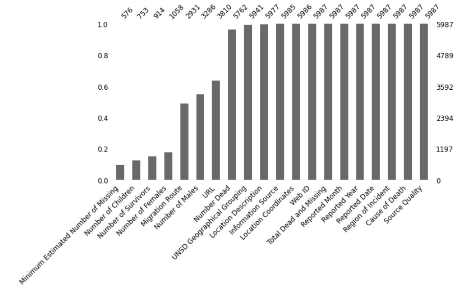
missingno.bar(df, figsize=(10,5), fontsize=12, sort="ascending")
The function above produces a bar chart to visualize the number of data in each column.
If you want to calculate the missing data in the log number, we can use the following code.
missingno.bar(df, log=True,figsize=(10,5), color="tab:green", fontsize=12,sort="ascending")Log numbers could help you know the percentages of the missing data in each column.
Missing data could have a pattern, whether because of another column's presence, timely manner, or purely chance.
To visualize this missing data pattern, let’s try to visualize the missing data location in the dataset using a matrix plot.
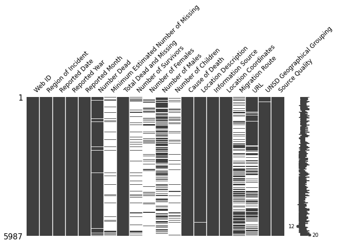
missingno.matrix(df,figsize=(10,5), fontsize=12)For context, our Migrant Missing Project dataset is sorted by time (from 2014 to 2019) from recent to the oldest. The top data position is recent (2019), and the lowest is the oldest (2014).
If we look at the graph above, the ‘URL’ missing data seems more present in the older time and similar to the ‘Number of Males’.
It differs from the ‘Migration Routes’ column, which has increasingly missed data recently.
The graph above could give us a better insight into what happened in our dataset.
Using missingno, we could visualize the nullity correlation (range -1 to 1) to measure the missing data relationship between features. Let’s try it.
missingno.heatmap(df, figsize=(10,5), fontsize=12)The nullity correlation gives us the relationship between columns missing data.
The closer the score is to -1 means where one column’s data is present, the other would be missing.
In contrast, where it is closer to 1, the data is present when other column data is present. 0 means no correlation between the features.
To understand even deeper the missing data relationship between features, we could use missingno to build the dendrogram based on a hierarchical clustering algorithm and the nullity correlation.
missingno.dendrogram(df, figsize=(10,5), fontsize=12)To interpret the dendrogram above, we would look at it from a top-down perspective.
The features or clusters linked together in the nearest distance are shown to predict each other missing data or present data better.
For example, the features’ Number of Survivors’ and ‘Minimum Estimated Number of Missing’ are clustered together earlier, which means they predict each other better than the different features.
The cluster feature linked together in the zero distance means they fully predict one another (One is missing, the other is present, or both are always missing/present).
The leaves cluster that split not at zero means they could predict each other but might be imperfect (the closer to zero, the better they predict each other missing data/present data presence).
That’s all you need to know on how to use missingno.
Are there any more things you would love to discuss? Let’s talk about it together!
👇👇👇


